There’s a big question hovering over the website industry right now: Why are mobile applications performing much better than mobile browsers?
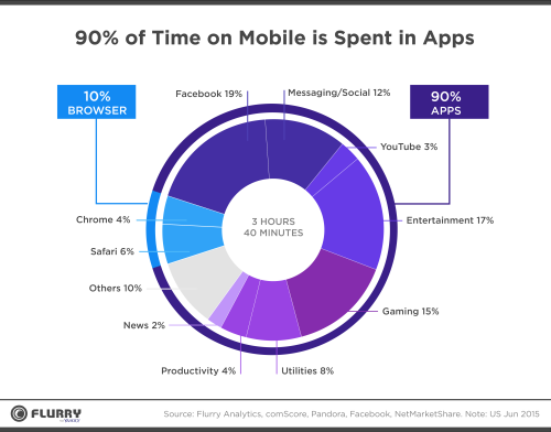
Well, there are a few reasons, but the first has a lot to do with usage. As we shift to a mobile-first mindset, it’s no surprise that mobile usage surpassed desktop usage in 2014. But it didn’t take long for that usage to shift from mobile browsers to applications. In fact, a whopping 90 percent of time spent on a mobile device is inside an app, while only 10 percent is inside a browser.
Take a look at this chart that breaks down how users are spending time on their mobile devices. You can see most of their time is consumed by apps, including Facebook, YouTube, games, and entertainment. Only a small fraction of their time is spent in actual browsers, like Google Chrome and Safari.
Another main reason mobile apps are outperforming browsers is the ease of use, or User Experience (UX). In simplest terms, the content and design of an app are designed around what the user wants. Not in the sense that the user gets to design the app how they please, but in the sense that the application industry has made it a standard to design for UX. While the website industry has started making these updates, it is falling behind in responsiveness, which is why we’re seeing a growing trend of websites that are designed more like apps.
Function and Design: Websites vs Apps
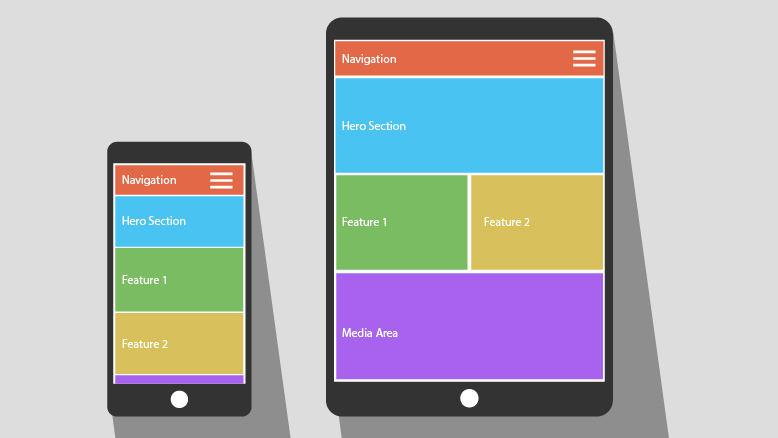
What’s the biggest difference between a responsive website and an app? Minimal design that expands to all devices, including desktop. For example, when designing a responsive website, there’s usually a lot of content involved. However, when translated to a mobile device, that content can become overbearing and leave users with a long page of content to scroll through. Applications, on the other hand, display content in a way that is extremely easy to scan and digest. Easily recognizable icons, large tap targets, larger fonts, and smaller image sizes also give apps the one-up on websites on mobile and desktop screen sizes.
Applications provide the same experience across all mobile devices.
Shifting to an App-like Mindset
So how can we make an existing or new a website look and function like an application? Let’s break it down.
-
Start with a content audit.
This gives you a chance to reexamine your existing content and decide what is absolutely necessary for the user to get the information they need. Find ways to compress the content into easily digestible sentences and short paragraphs.
-
Create an outline for each page.
Determine out the content hierarchy (what is most important to the user) and use descriptive but concise headline tags (h-tags) to help with scannability. Don’t forget that imagery and icons are also considered content.
-
Add in design elements.
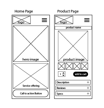
Finally, decide what type of design elements will be displayed on the page and create simple wireframes for the mobile layout. This will help you get a clearer picture of what the final product will look like to users. Example of wireframes:
-
Test the design on a desktop.
Once the wireframes are complete for mobile, use the same content and elements (nothing more, nothing less) and display them in a similar format on a desktop screen size. Doing this ensures the User Experience will be the same across all devices, resulting in consistency and happier users.
-
Do some UX testing.
Testing the user flow and wireframes is a crucial step in creating the best UX for the website. Testing often will avoid issues in the future stages of development, and also helps find any issues with the original wireframes and content choices.
User Needs, Not Company Wants
One of the most important things to remember when designing or redesigning a website is that your website speaks for your company. Sure, you want it to look pretty, but you can’t let your wants trump the needs of users. When your website is easy to use, it will be that much easier for users to purchase the product or service you’re selling. Think of it as having a manager on the clock 24/7 to make the process of purchasing faster and easier, but without the extra cost.
There’s no denying we live in an era where more time is spent using apps that are designed for the user in mind, not the company. Now that the website app design trend is spreading fast, the only question left to ask is: Will your company make the switch?


