By now, you’ve probably heard why we’ve decided it was time for us to rebrand. But with the launch of our new website, it’s time to dive into the strategy behind it. That’s right, we’re giving you an inside look into what our big idea – Paving the Way – is all about.
Sure, we’ve created a new logo and refreshed our brand with a splash of bright colors. But to us, this rebrand wasn’t about appearing “prettier.” It’s about better communicating who we are as an agency to our clients, employees, and the general public.
Beginning the Creative Process
To begin the rebrand, we surveyed our clients and employees about their perceptions of Go Local. After all, no one knows our company better. Among the responses, we noticed some common themes from which we built out our brand and came up with our big idea: Paving the Way.
Over the past few weeks, we’ve been dropping some hints as to what exactly this means to our employers and clients. But, here’s a quick recap, in case you missed it:
Every business has a unique journey. And at Go Local, we’re here to create a direct path leading to our client’s website, storefront, social pages, and every stop in between. Just as each of our clients are different, so are the journeys their customers take to find them. We are helping our clients pave the way to their customers.
Similarly, each of our employees has the ability to create a custom path to excel in his or her career. Whether it’s starting as intern and coming on full-time or starting a new department, we allow our employees to explore where their strengths lie. We’re here to help them pave the way for their future.
Logo + Color Scheme
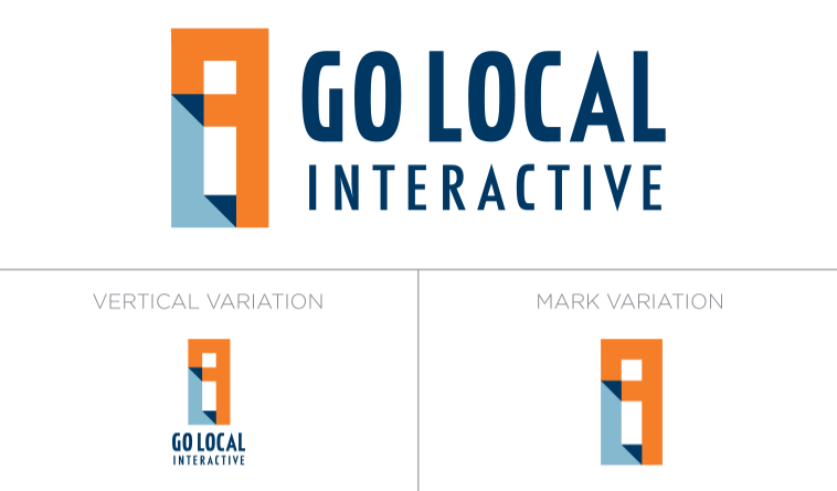
Now that you’ve got a better understanding of the strategy behind our big idea, let’s talk about the design choices we made to reflect it. We knew we wanted a logo that would symbolize a path. You can see that our new logo does just that, creating a linked path between the letters G, L, and I. Yep – there’s a hidden “i” in the middle, just to show some of our creativity. The triangles in the logo demonstrate transparency — something Go Local practices with our clients every day.
With a fresh logo under our belt, it was time to incorporate some colors that accurately reflected who we are. For those of you who were familiar with the old Go Local, you know that green and blue have always been a part of our identity. As tribute, we haven’t left those colors out; we’ve just created a more modern and mature palette. By adding a few new colors (namely orange), our new image continued to evolve into a better reflection of who we are as an agency. In fact, each of our colors adds to our brand through its color associations. Don’t believe us? Here’s how:
- Orange: The color of creativity. Orange evokes a friendly, fun feeling that matches the Go Local environment. Additionally, orange embodies a sense of our warmth and communication.
- Navy Blue: Navy blue evokes credibility, reliability, and confidence. It shows Go Local is committed to providing quality work and transparency with our clients.
- Light Blue: Light blue represents our aptitude for fresh ideas. It communicates liveliness and agreeability. This color is strongly associated with patience, which demonstrates the nature in which we communicate with our clients and employees.
- Light Green: The strongest association of light green is with growth. Our agency continues to value growth in capabilities and numbers. We want to continue learning and developing to produce the best for our clients and further the career paths of our employees.
- Dark Green: Representing the ambition of each of our employees, dark green also communicates the energy of our office and the time we put into fostering that drive.
It’s in the Details
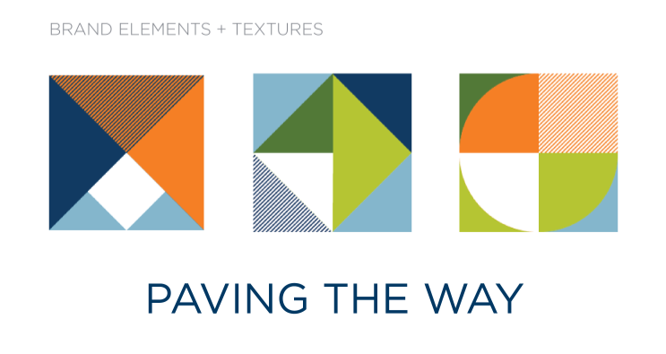
So how does “Paving the Way” fit into the rest of our new brand identity? You’ll notice new design elements that incorporate many shapes and a specific, lined texture. This use of shapes and lines helps to communicate the different paths we create for our clients to reach their customers and the unique journeys our employees take to further their careers. This ensures that every piece of our brand identity is communicating our big idea.
Put Our Process to the Test
As you can see, we’ve put a lot a thought into forming our new brand. And we had a ton of fun rediscovering ourselves along the way. If your company is interested in rebranding or building your brand from the ground up, give us a call or shoot us a message. We’re more than happy to help you communicate your company’s story and purpose.
Now go explore our new site!


